My Universe

Empowering personal finance management app with a single window view into user’s financial world.

PROJECT OVERVIEW

Aditya Birla My Universe PFM mobile app is first of its kind in the Indian market which empowers Indians to make better financial
decisions. This is achieved by answering the top three questions of the user:
1. How am I spending my money?
2. How much money do I need to invest to achieve the things that matter to me?
3. How can I invest quickly?

ABMU team approached fractal to make an app out of their existing successful online portal to further empower their clients to
always be up to date with their expenditure and investment performance.

PROJECT OBJECTIVES

1. Empower users to make efficient financial decisions.
2. Educate and build awareness.
3. Enable goal based investment and savings.
4. A single window view into user’s financial world.

MY ROLE

The ABMU team comprised of a project manager, 2 UX Designers and 2 UI Designer. I was responsible for the initial user research, entire UX executions and a helping hand for UI designs.

THE APPROACH

We used the Double Diamond structure to understand customers and their problems and explore creative and innovative ways
to solve their problems and delight them. Using the double diamond, we approached problems and solutions by using 2 different
types of thinking: divergent and convergent.

Divergent thinking — Think broadly, keep an open mind, consider anything and everything.

Convergent thinking — Think narrowly, bring back focus and identify one or two key problems and solutions.

There are four phases to this approach:
1. Discover customer problems.
2. Define specific customer problems.
3. Develop potential solutions to these customer problems.
4. Deliver feasible and viable solutions to these customer problems.

THE DISCOVERY

In the first step we practice divergent thinking. This means we open our minds and consider everything about our customer,
constrained by nothing. We got in touch with 4 active users of the app. In my understanding, it is best to focus on experienced
users. Experienced users are more likely to encounter issues with the interface due to their frequent use of their existing web
portal.

Target Audience

Two main categories of users:

1. Personal finance management user to save money
• Keep track of Daily spending
• Refer the expense analyser
• Aggregate multiple accounts

2. Investments user to grow savings
• Explore the Mutual Fund database on the app
• Track investment performances
• Refer to the advisory ability of the app


Key Insights
Improvement of the following 3 pillars could be pivotal for the success of the app

Personalization

• Identify user categories accurately
• Recognize their expectations and customize app interface accordingly
• Information must be distributed in a layered format to ensure user isn’t intimidated upon arrival and her journey is unperturbed

Discovery
• Expert discovery – A direct product / feature search by an expert level user
• Intent based discovery – User has a broad intent for exploration, needs assistance to reach the specific path
• Tag based discovery – User is set on a guided path, based on his app journeys and purchases, resulting in potential up-selling

Advisory
• Better recommendations based on exactly what the user is looking for.
Example – Novice users being directed to informative blogs and articles. Experienced users being introduced to new tools and
reports of funds that are performing well consistently, encouraging more transactions

Knowing the target audience and their basic intent, we moved and created personas that we could come back to throughout the project to guide our design decisions and priorities. Based on my understanding after talking to users, I envisioned the ideal user to be thinking about his/her personal finances and want to achieve his/her financial goals.

Competitve Analysis

We studied 5 similar apps to understand what are the exisiting solutions and what’s good or bad about it. This helped us not
recreate the wheel. We studied entire applications but focused our benchmarking report on the following aspects.

Job to be done framework

Job to be Done is a theory of consumer action. It describes the mechanisms that cause a consumer to adopt an innovation. It’s the process a consumer goes through whenever she aims to change her existing life-situation into a preferred one, but cannot because there are constraints that stop her.

Products enable customers to get a Job Done

Keeping the above data in mind, I designed 2 main job stories for our users…

1. When I get my salary, I want to be able to control and analyse my expenditure so that I can save money for my desired goals or an emergency.
2. When I am trying to invest, I want personalized recommendations and advice so that I can make an informed decision and make the most out of my investment.

THE EVOLUTION

After understanding the pain points of our users and having established that we weren’t making a better PFM app but developing financially responsible and empowered Indians, we moved on to creating task flows and information architecture to enable our users with simplest way to finish their jobs.

Task Flow Diagrams

We created many task flows from linking of bank accounts, to tracking and transacting on the basis of the mental model of our
personas to get to the bottom of what the user will want to do and the simplest, most effective way of doing that. Below are some
examples of what they looked like…

Information Architecture

Next in the process was to prepare an information architecture map to realize the visual hierarchy of the application’s layout.
We organised the entire application under two main segments i.e TRACK and TRANSACT since these two were the 2 main jobs users wanted to get done

Wireframes and UI and testing and all of that…

Next step in the process was to start making wireframes to actualise our concepts and strategy. Our wireframes were quickly
sketched out and begun testing almost immediately, to quickly identify what works for our users. We had limited to no access to
real users for this round of testing so we decided to test with potentital users from within our own design studio with our fellow
designers and non designing staff. I know this is not ideal but some testing is better than no testing…

One major decision in the app, was to focus on personalisation. Our aim was to improve user engagement by understanding more about a user’s personal preferences, allowing us to predict and tailor products for each individual user.

One major decision in the app, was to focus on personalisation. Our aim was to improve user engagement by understanding more about a user’s personal preferences, allowing us to predict and tailor products for each individual user.

REFLECTIONS

This project is really special to me as it was my first professional project and I made some super cool and talented friends…

The biggest learning for me is that nothing just happens, in design or in life.
For design, I’m still getting a better handle on finding as broad a stream of inspiration as possible to show that I’m not just making things up. I’m also devoting more time to the skills I didn’t come into the program with. It’s comforting to know that even the best designers in my cohort are in the same boat as me in that respect.

In life, it was humbling and some days downright terrifying to be surrounded by a talented cohort of educators and peers who were willing to take the time to bring me along, sometimes drag me kicking and screaming, into a new life.

Lessons learned…
1. Start early. No, earlier than that!
Time is not your friend, and there will be so many things you’ll want to include in an experience that will have to wait. Also, if you’re just starting out and on a learning curve, you’ll need time to get better at the skills needed to actually pull the whole thing off.

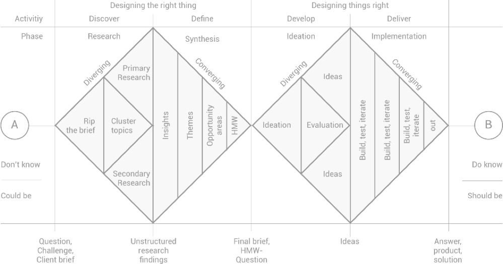
2. Centre yourself with the human elements. It’s called user experience design, after all.
Further to this point, think of yourself as the design part of the human design. The humans are the vehicle through which you’ve gleaned your insights, and should remain the focus throughout the design. Additionally, this will stop you from designing just for yourself.

3. Dare to be dumb.
I struggled with sharing my early work because it was so much farther behind some of my more classmates with a background in design. Now, I’m kicking myself, because all of that time spent agonizing over not comparing could have
been spent actually improving with them.

4. Offer your skills, not your weaknesses.
The caveat for sharing? Don’t be a burden on the talented people around you. There’s a give and take to creative circles, and even if all you can offer is a work ethic to improve, make sure you always bring something to the table. Everyone
appreciates snacks!

5. Fail often, fail early, fail graciously. Iterate, iterate, iterate.
You’ll learn so much from admitting and confronting your blind spots. However… If you can show your work and someone else isn’t getting it, stick to your guns. Point to your process. The best part of gathering a wide amount of inspiration? Whenever someone asks “Why did you choose this?” whether it’s colour, layout, typography, cat videos, you can instantly point to something that already exists and say “This is why, and this is why it works for my users”. You may still have made a choice that isn’t strong, but this way you’re correcting the entire choice, not just “Well, I liked it…”. Of course you liked it, you put it in there.

6. Finally, design isn’t as subjective as you may think.
There are elements of preference and taste that come into play, but good design can actually be charted. You have to practice to get better, and that includes practice finding inspiration and communicating those choices.

RECOGNITION

The product never saw the light of day and was put on hold indefinitely by the Aditya Birla team
but our designs managed to win the Best Mobile App for Banking – Gold
by MOBEXX Awards 2017 preseted by Adgully.